

Introduction
A marketing email is a combination of carefully crafted parts, aimed at garnering maximum engagement. Of these, color plays a vital role, adding subtlety or exuberance to the email. With the right combination of colors, you can effectively ensure you convey the appropriate message to your subscribers.
Whether it’s seasonal, motivational, or a sale reminder, there’s a right color for every kind of email. You can choose colors that support your message, resonate with subscribers’ interests, and encourage subscribers to engage. Let’s delve into the world of colors and learn how you can best use them in your email marketing.
Importance of colors
Always remember to use colors specifically and judiciously. Restrict yourself to two or three colors, including brand colors, and make the most important color more visible than the others.
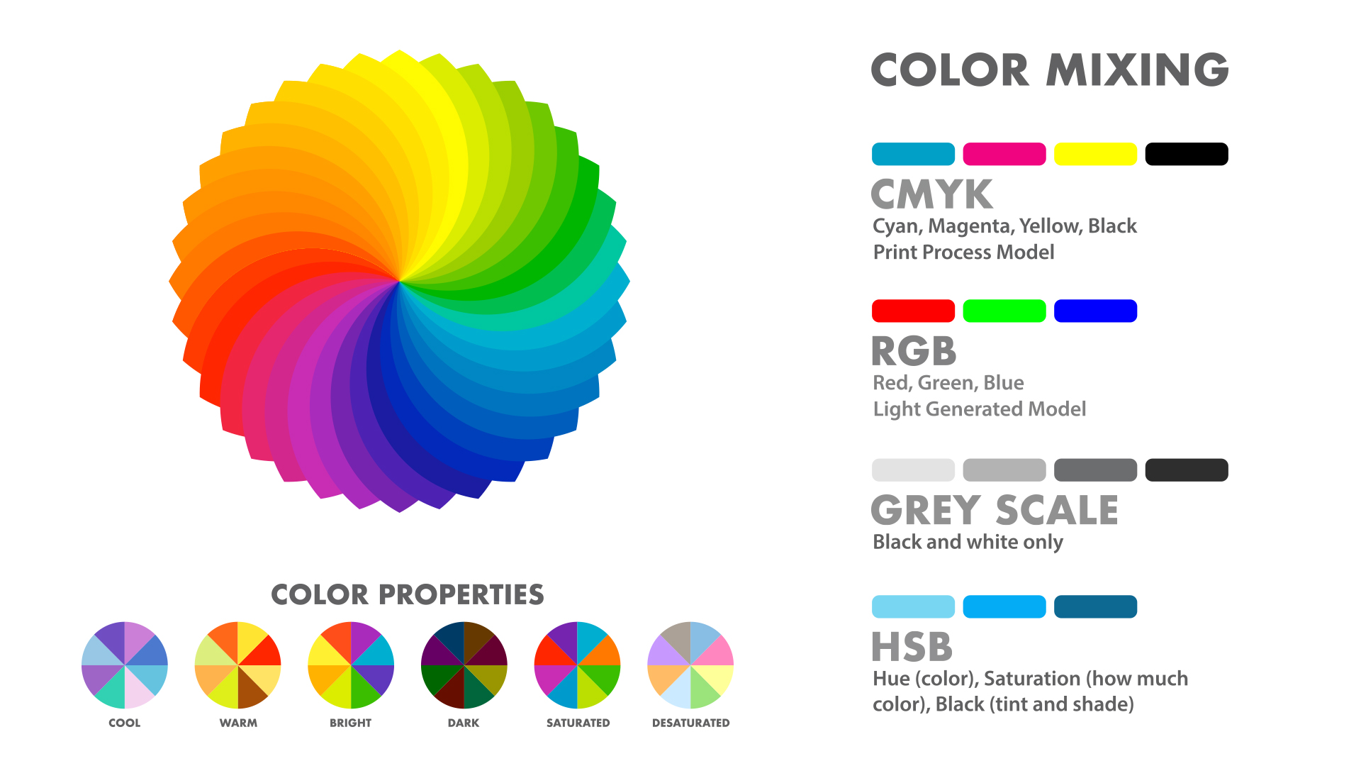
As all colors are red, green, blue, or a combination of the three with varying percentages (RGB), you should research a bit about the RGB value of your brand color and experiment with different combinations that work well with it.
You should generally try to include no more than three colors in your email templates:
-
Your primary color needs to be the most important color aligned to the message your brand logo provides and should also be the most prominent in your template
-
The secondary color, less prominent, needs to be an excellent filler for the primary color. It should also complement the message
A tertiary color can be used to provide a completeness to the entire message and the other two colors used in the email
Check the table below to see how the three major colors interact:
Use of colors in content
The use of colors in email content can be divided into two sections:
General use of colors
The background in an email template acts as a canvas, whereas the foreground contains the text, images, and other elements. The general rule is to opt for a light background and dark foreground or vice-versa.

As an email marketer you need to showcase the message and other features of the email template. So to make the message stand out, you need to choose your template’s background and the foreground very carefully. White and black are less vibrant, but good for creating balanced combinations with other colors.
Use of colors in elements
Colors are used in template elements to achieve:
-
Division
-
Contrast
-
Consistency
Division
Division allows you to accommodate more and varied information in your emails. Let’s say there’s a winter sale going on and you need to show the images of apparel. Even though they’re all winter clothes, they’re going to differ in certain respects. You can use divisions to show the types of clothing in separate sections of your template to address these differences.
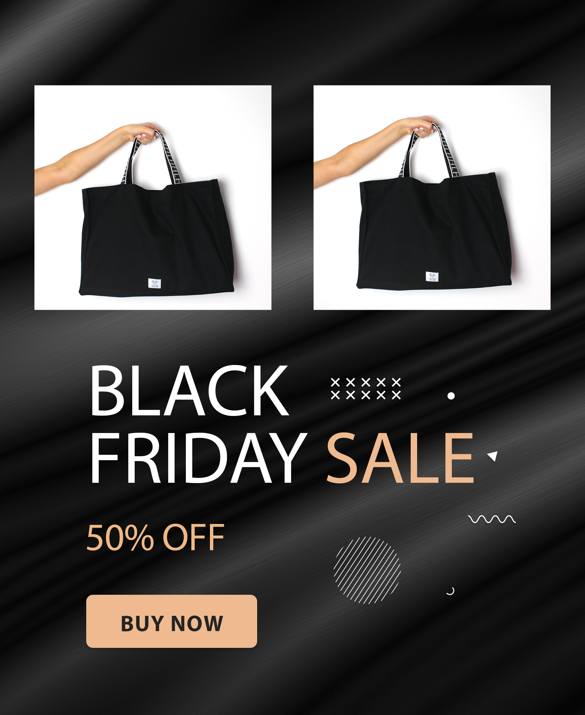
Use different colors in different sections and try to match the mood or occasion the apparel goes with. For example, colors such as red and yellow are associated with festivities such as Diwali in India, and green and red go with Christmas.
Try to reflect these colors when providing alt text, as that will retain the specificity of the sections even if the images are not visible
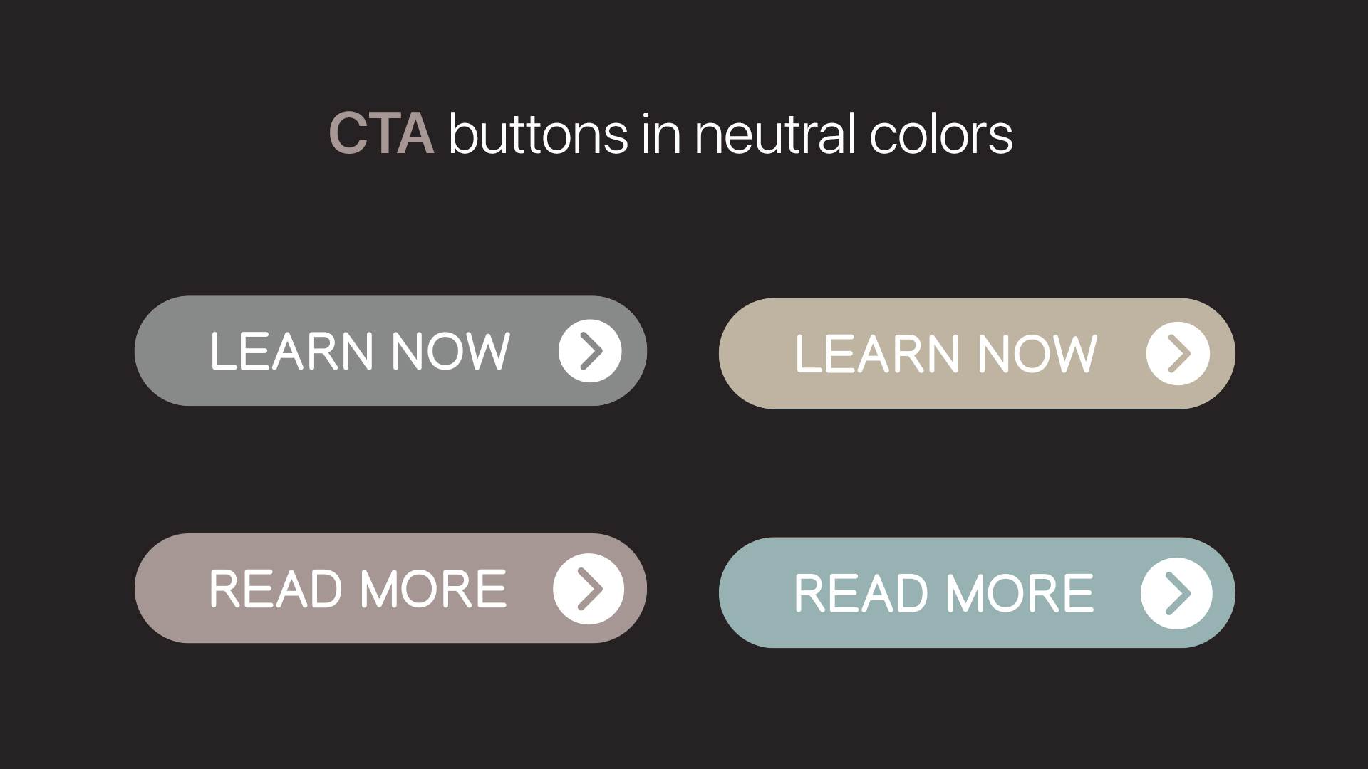
Contrast
Contrast between sections of an email can draw the reader’s eye to specific places. Using contrasting colors lets you effectively direct attention to the most important sections of the email. Here are a few examples of contrast in action:
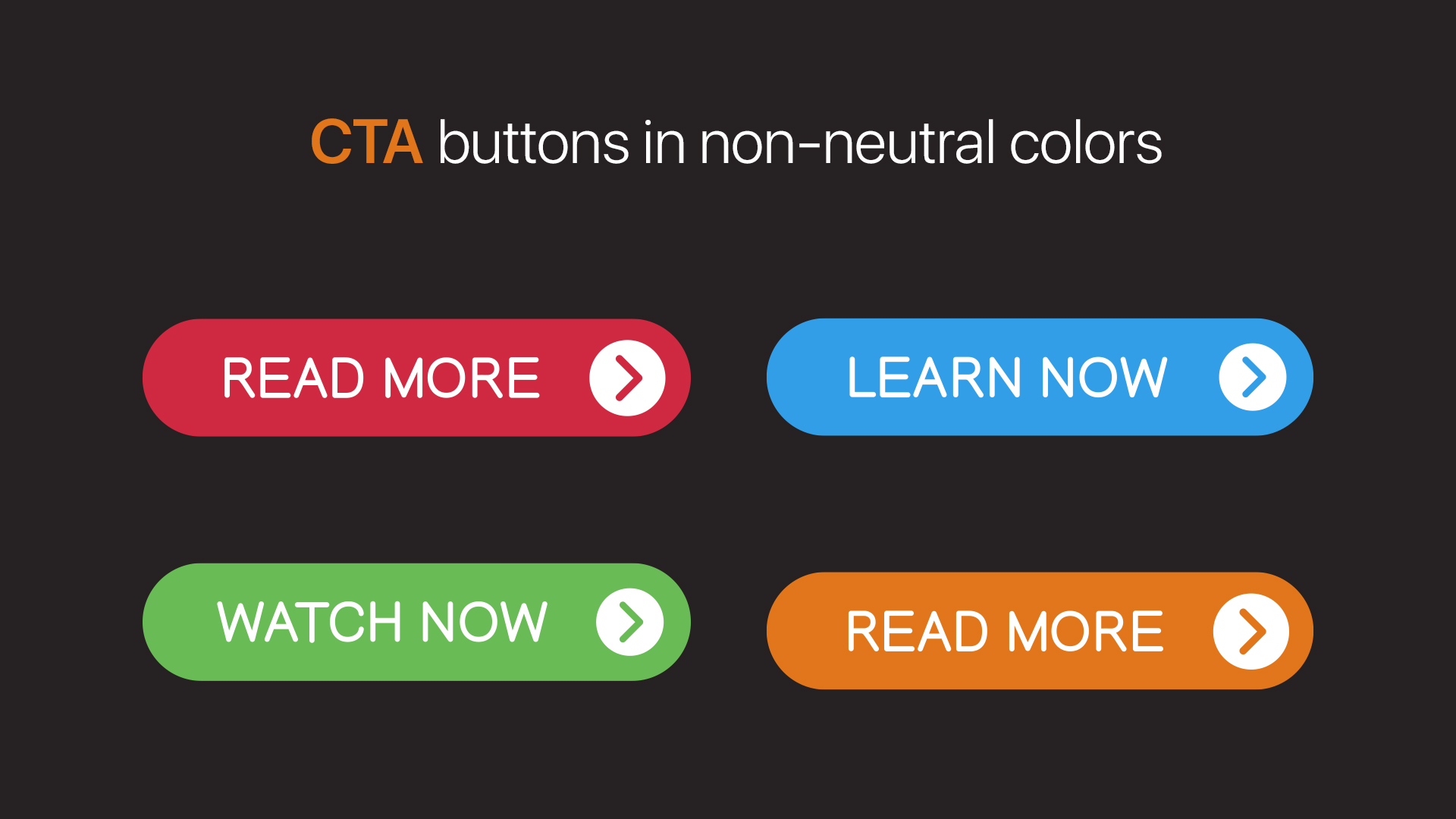
-
Use light backgrounds with dark CTA buttons or dark backgrounds with light ones
-
Avoid using neutral colors for CTA buttons, as they often blend into the background or don’t stand out
-
Opt for RGB colors for CTA buttons. Orange is also a good choice
-
Ensure that your CTA colors stand out, so they can generate better engagement from subscribers
Consistency
Consistency in email templates gives the reader a sense of coherence and continuity. This, in turn, builds a sort of trust among your subscribers. You can use the same color across multiple design elements—for example, the header text and a CTA button.
Determine color with segmentation
Factors influence colors and colors influence action. Your lists are segmented by common factors, so why not select colors for these segments? Segment your contact lists based on factors, such as geographic, demographic, gender, and past purchasing behavior.
Let’s see how some of these factors influencing segmentation can also help you in choosing colors.
Geographic
Orange is a color often associated with Halloween and autumn. While that might not be the case in some parts where autumn doesn’t signify fallen leaves, green or other nature-related colors can work well for those regions.

Segment your lists by geographical regions and choose the colors best suited for seasons and holidays pertaining to those particular regions.
Demographic
The age group of your subscribers can determine the colors they prefer.

Segment your lists by age groups and opt for dynamic content, catering two versions of one email to two different age groups.

Determine color with A/B testing
You can check the efficiency of your campaign with A/B testing. This will help you determine which colors can generate maximum engagement from your subscribers.
Colors that provide similar vibes or colors that hold similar cultural significance can be checked. You can also determine the tint and shade of the dominant colors used in your templates.

For instance, let’s say you’re about to send an email to try and get recipients to subscribe to a nature periodical. Commonly, green and brown both are good nature colors. You thus try out two versions of the same email, with version A as a green template and version B as a brown one. With A/B testing, you can easily figure out which version will resonate better with your subscribers.

Conclusion
Colors aren’t merely window dressing for your emails—their associations to people are cultural, geographical, demographical, and personal.
As an email marketer, you can connect with your contacts quite effectively by using the right colors for the right seasons and reasons.
Stay tuned for our next instalment, where we’ll discuss color schemes and the best uses of different colors.
Net Universe offers all Zoho subscritpions and consultant services with worldwide Delivery Services.
Send us an email to [email protected] for more information or visit https://www.netuniversecorp.com/zoho.


